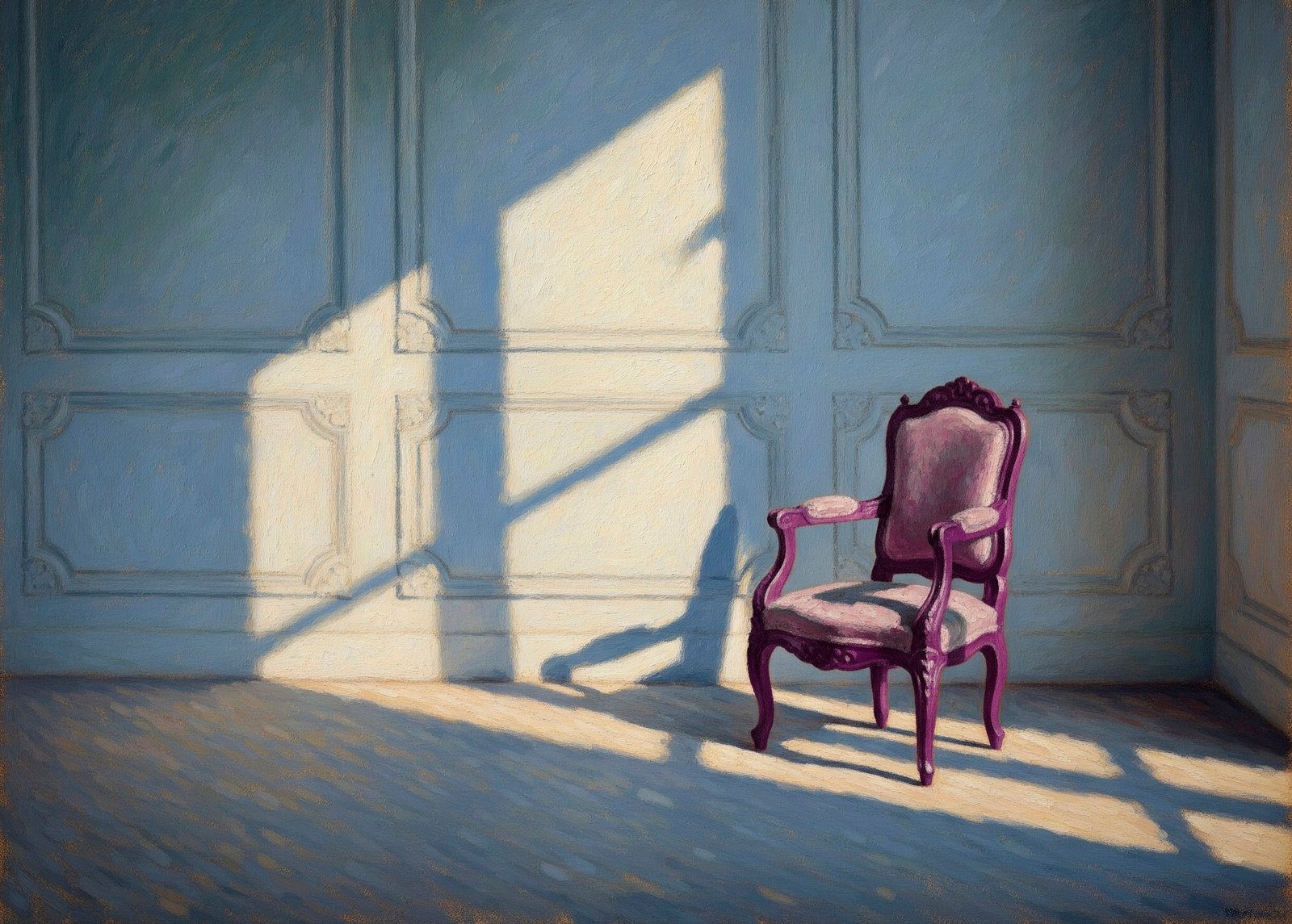
Almost emptiness. Image created with the assistance of Gemini AI.
Although decades have passed, I remember my first paid professional assignment like it was yesterday. It was for a family planning organization and involved illustrating a simple instructional booklet on what to do during an emergency birth—one that might take place on the street, in the back of a taxi, at home, or en route to a clinic.
I spent two weeks on it, completely absorbed, and proudly delivered the final artwork. The client looked at it—serious at first—then smiled at a drawing of a newborn speaking to its mother as it emerged into the world. I exhaled with deep relief. I’d learned that a client’s smile often meant the coveted green light.
But then he raised his eyebrows and said, kindly:
“Have you thought about increasing those margins a bit?”
He might as well have asked if I’d considered printing it backwards or translating it into Chinese. I was baffled. To me, those 1/8-inch margins looked perfect.
His comment hit me so hard that I ended up redrawing all 12 pages—by hand, of course (this was pre-computer era). And then I dove into a long period of research. No one had taught me about minimum margins in university. I hadn’t seen it in a single textbook. But yes—horror!—they existed.
Over time, my research deepened and took me beyond technical rules to the philosophical. I came to understand the role of empty space in composition. It’s like silence in music: without it, there can be no rhythm, no order, no harmony. No movement, and no stillness either. Without space, there is no music at all.
I never made such a rookie mistake again. If anything, I’ve erred on the side of too much space ever since.
The real challenge in those early years was explaining to clients the profound importance of empty space. Many had a real fear of it. Questions like “What are you going to put there?” or “Why don’t you just enlarge the title to fill that gap?” made it clear: the white space felt like a problem to be solved, not a deliberate design decision.
So I armed myself with patience—and my inner teacher—and explained again and again why that space was there.
With time and experience, those explanations became less and less necessary. Eventually, I no longer had to explain at all: the design itself began to speak for me.
And what a relief that was.
To this day, I bring that same attention to space, meaning, and communication to every project I take on—because design is never just about filling the page. It’s about making meaning clear.
If you’re working on something that deserves clarity—
Leave a Reply