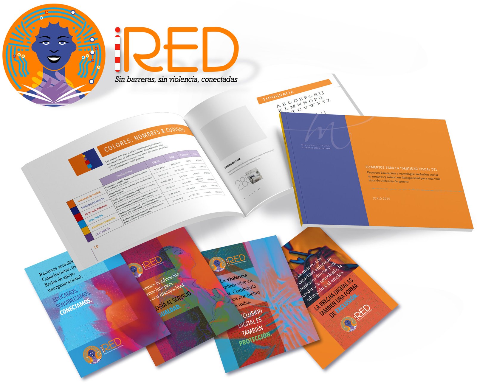
Visual identity & Brand Image
The challenge
The project faced the challenge of overcoming a triple barrier: digital exclusion, disability, and gender-based violence, while dealing with an official 19-word name that was impossible to use in branding. A visual identity and a name were needed to encapsulate this complex mission in a concise and memorable way.
Our solution
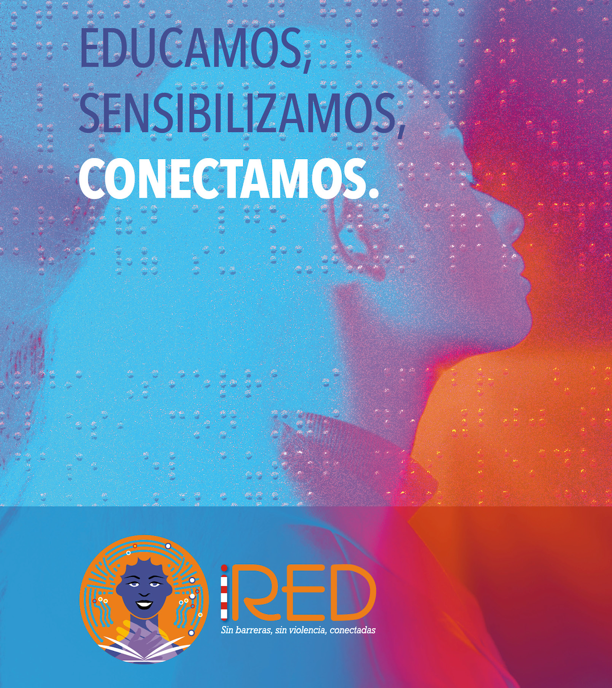
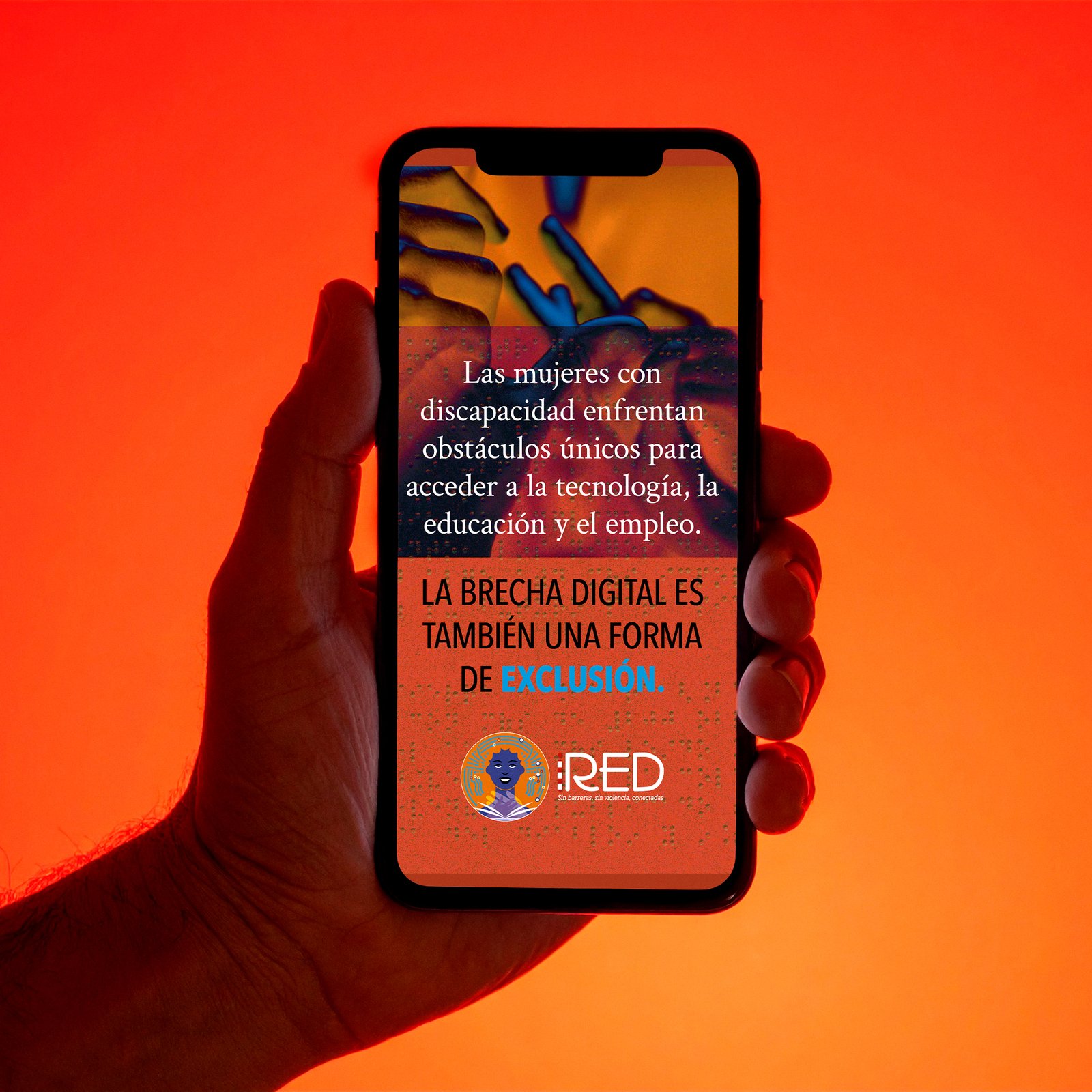
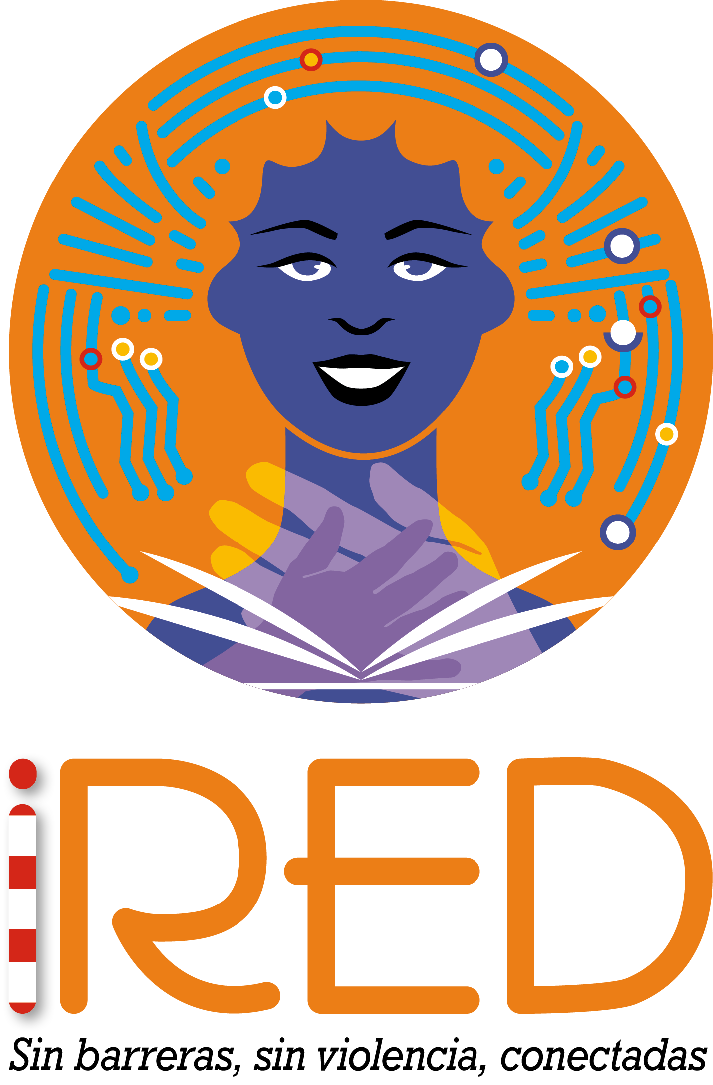
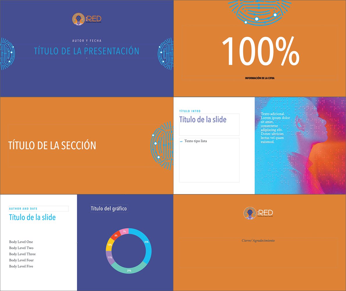
We led the development of the strategic name iRED (connectivity, inclusion, Internet), a tagline, and a visual identity. The logo design and graphic line created a high-contrast, highly legible visual system that prioritizes functionality and the digital empowerment of women and girls with deafblindness.
The impact
The iRED brand became a concise and accessible symbol that solved the length issue and articulated the project’s complex social mission. The result was a strategic, functional, and empowering visual identity that drives social inclusion to advance closing the digital divide.
Project details